Trends & Insights from an Industry Pioneer
About Subsurface Reflections:
The goal of this blog is to share interesting and inspiring articles related to subsurface imaging and geophysics. Written by experts in the field of geophysics, ground penetrating radar, software development and data analysis, this is a source for insights about the practical application of technology in the field of subsurface imaging and a place to shed light on common misconceptions in the industry.
Time and frequency – pulses and spectra
In the prior blog, we addressed the jargon that springs up around GPR regarding time and frequency and attempted to provide a basic explanation of the terms. In most instances, visualization of the concepts is the best way to demonstrate these ideas. To increase...
GPR Jargon – Time and Frequency
The last blog on jargon was driven by frustration about how far we, in the GPR community, have drifted from the fundamentals. Our devices and methods are clearly not readily understood by the general user community. Teaching new users makes the problem abundantly...
GPR Jargon – How do we say what we mean?
In attempting to discuss a topical aspect of GPR, I realized how confusing we have allowed the GPR world to become to the average user. The expanding and advancing of the GPR world means that new uses and terms continuously appear. The characterization...
Ground Penetrating Radar (GPR) and drones – double jeopardy!
For the past 5 years and more, we at Sensors & Software have received a continual and growing stream of inquiries about mounting GPR on unmanned aerial vehicles (UAVs, most commonly called drones). The opportunity of merging these technologies is truly...
Ground Penetrating Radar (GPR)

Dr. Peter Annan
Founder & CEO
Peter is the CEO of Sensors & Software. His scientific research has been recognized worldwide with numerous awards for his pioneering work in ground penetrating radar (GPR) instruments and data analysis methods. He has authored multiple scientific publications, patents, and technical reports and served on various government and professional committees.
Time and frequency – pulses and spectra
In the prior blog, we addressed the jargon that springs up around GPR regarding time and frequency and attempted to provide a basic explanation of the terms. In most instances, visualization of the concepts is the best way to demonstrate these ideas. To increase understanding, we will present visual representations that we use in our educational courses on GPR.
Let’s introduce a little more jargon here, pulse and spectra (the plural of spectrum). Time domain GPRs focus on creating and detecting pulses. Frequency domain GPRs focus on creating and detecting sinusoidal signals with a range of frequencies and varying amplitudes; the amplitudes and frequency values form the signal spectrum.
The concepts of time and frequency come alive with these illustrations. The time and frequency worlds are linked and are just different ways of describing the same thing.
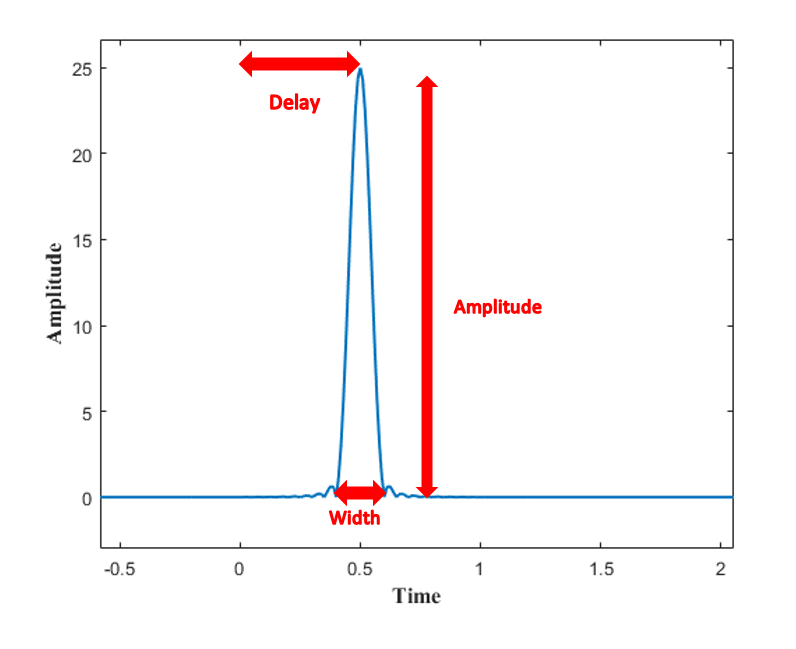
First, we will illustrate what we mean by a pulse. An audio analogy is helpful. A gunshot creates a sharp short duration sound that we hear. The sound detected by the ear is the result of a short duration air pressure change impinging on the ear. One of the ways of presenting this pressure pulse is to make a graph of air pressure versus time as illustrated below.

The pulse is primarily characterized by its amplitude, its time duration (width – in this case 0.2 time units) and the time it appears as referenced to start time (this is called the time delay which is 0.5 time units to the peak). There are other details, but we will keep it simple for now.
For GPR, we measure an electric or magnetic field versus time and display the field strength in the same graphical manner. While the field is invisible to the eye and normally not sensed directly by humans, instruments are designed to sense the fields and transform them to a voltage that varies with time just as the fields. This conversion, which occurs in the GPR receiver) allows a graphical presentation of the fields, such as presented above. (This is what ‘time-domain’ radars do; they create a display of a field component versus time).
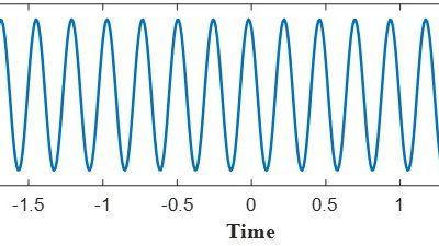
The concept of frequency spectrum is more complicated to explain. The first step is to understand what we mean by a sinusoidal signal. The concept is best illustrated by using an amplitude versus time graph. Frequency as we have discussed previously is a measure of how many times a signal repeats itself in a given interval. A good visual of the concept is a swinging pendulum; plotting the distance of the pendulum from its equilibrium position versus time traces out a sinusoidal curve.

The distance value varies between two extremes at regular time intervals. The transition between extremes follows a smooth curve called a sinusoid. The signal is characterized by the maximum displacement value (amplitude) and the number of peaks or troughs in a given interval of time (frequency). In this case 2.5 oscillations in 100 time units. In the standardized scientific terminology, one cycle per second is referred to as 1 hertz (Hz) after the famous radio scientist Heinrich Hertz.
Radio and TV signals are formed of electromagnetic fields that vary in a sinusoidal fashion. They differ a little from the ideal sinusoid in that the frequency and or the amplitude changes slightly over time; this change represents the information being transmitted (music, voice, image). In general, the variations are very small. Most often a radio station will be identified by its dominant or carrier frequency (i.e. the station called 99.9 on your FM radio means the frequency is 99.9 MHz).
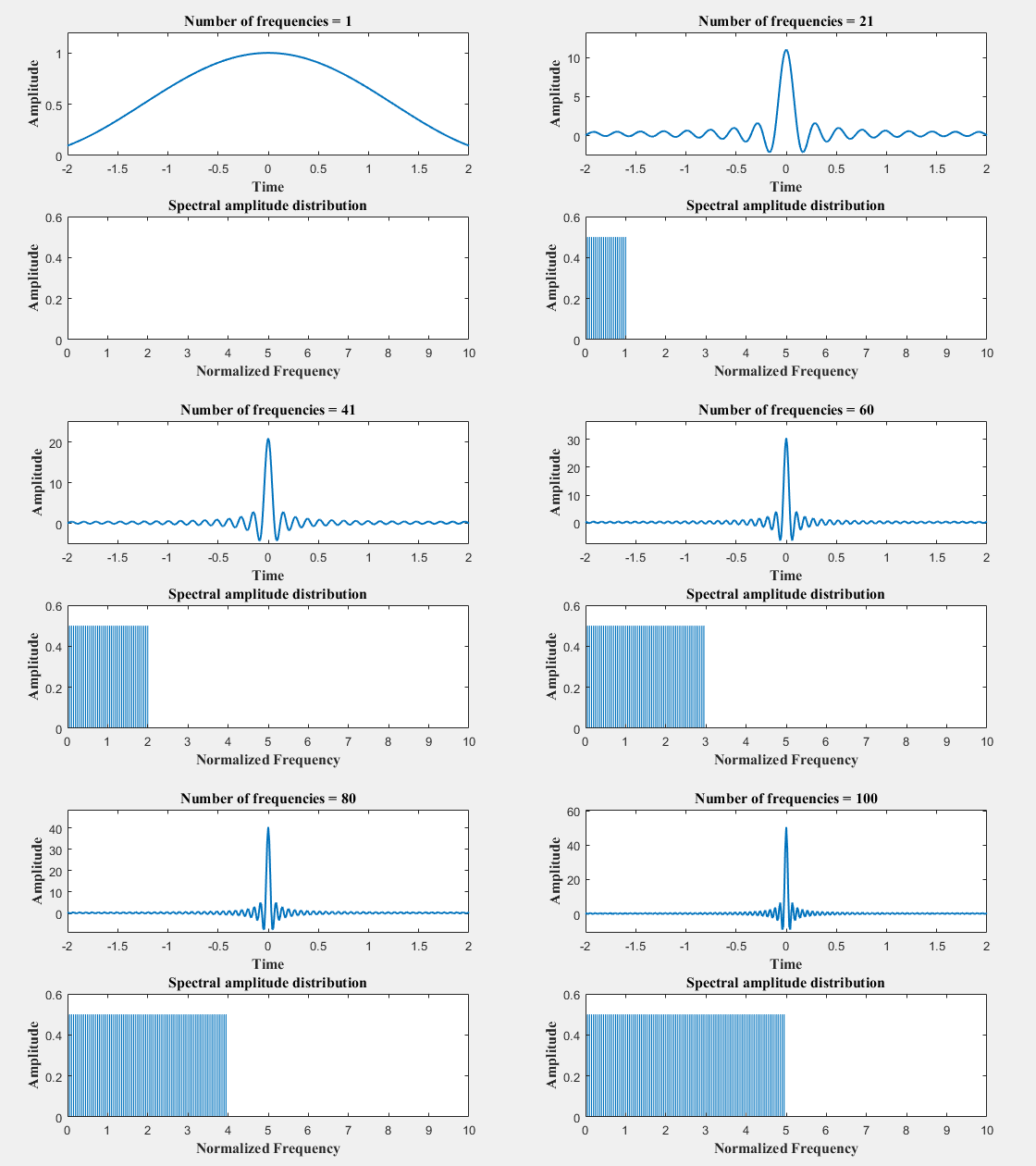
So far, we have used a graphical representation of signals versus time to convey the meaning of a temporal pulse and frequency. There is no obvious relationship between the pulse and the oscillatory signal. The magic comes about when many sinusoidal oscillations having differing frequencies and differing amplitudes are added together. The spectrum is the term used for this set of amplitudes and frequencies. Let us illustrate this by adding together sinusoids that have frequencies of 0 to 50 in graphical form. In this simple case, all the sinusoidal oscillations have the same amplitude.

This animation shows the result of successively adding sinusoids one at a time. The top part of the image shows the time graph of the resulting signal. The lower part of the image shows the amplitude of the sinusoid for each frequency added to into the signal. This lower plot is called the amplitude spectrum of the signal.
What is amazing is the transition of the signal from a simple sinusoidal variation to a pulse shape as more and more frequencies are added. What you are seeing is the magic of Fourier analysis. Essentially any time varying signal such as a pulse can be constructed from sinusoids with a specified spectrum. Vice versa, although not addressed here, a pulse can be decomposed into a superposition of sinusoids of specified amplitude and frequency.
Frequency domain radars essentially do all their work by creating and adding sinusoidal signals at differing frequencies and achieve the same result as the time domain radars which directly create a pulse signal. The electronic components and circuit designs used in the implementation are often very different. For this reason, there is a lot of poorly informed debate that time or frequency domain is better. The fact is that the quality and fidelity of system component design are what differentiate these systems; there is no fundamental difference between the approaches except in the skill of the system designer and the knowledge of the user. So, when looking purely at the science, there is no clear winner for time versus frequency domain designs, although some approaches may be simpler or less costly.
While I have great concern about getting into this kind of detail in a blog, we unfortunately have allowed a huge amount of jargon to creep into the field of GPR at the expense of clarity. I know of no other way to establish a basis for sensible discussion. I hope by attempting to clarify these concepts our community will be better equipped to decipher various claims propagating the industry.
Future blogs will address other key topics that will help put a quantitative understanding to ideas like resolution, phase, bandwidth and other similar topics that are critical to GPR user understanding.


